So not too long ago I had a requirement to create an Table component for a client.
Before you shoot me down, I know this is generally a bad idea as the RTE in Sitecore has in-built support for Tables and there are Rich Snippets too. However there were a number of reasons that wouldn’t work well in this scenario, read on to find out why.
But, but RTE!?
There were some specific requirements which couldn’t be met by the RTE or Rich Snippets fully, we needed to:
Add some specific mark-up, classes and wrapping divs around the table (some of this was for responsive requirements).
Enforce Table header, body and footer rows
Reduce the options for cells and rows to control better what content editors can do (for consistency).
Be able to update the table mark-up easily in the future (so Rich Snippets wouldn’t work well here either)
Limit the RTE options within a cell also to control better what content editors do.
Ok so how does the Component work?
So I did a bit research and thinking about various options and I liked Ben Golden’s answer on SSE. This provided a simple solution using Sitecore’s standard item and child item architecture to structure the tables.
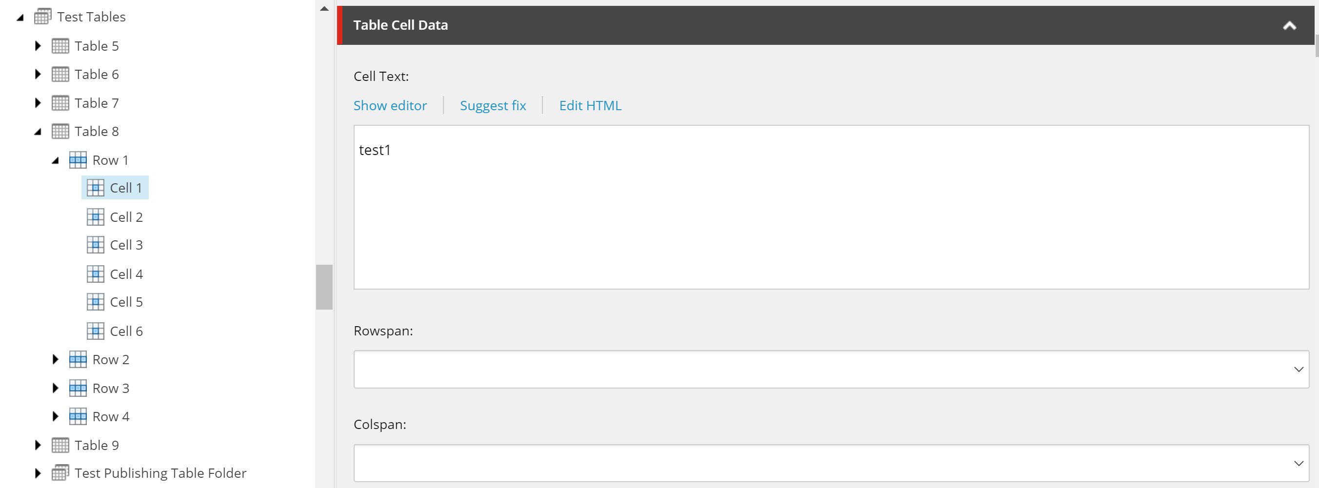
So this is what I went for, it looks like so in Sitecore:
As you can see the structure is Table > Row > Cell(s) and the Table has 3 fields. More could be added easily if required in future.
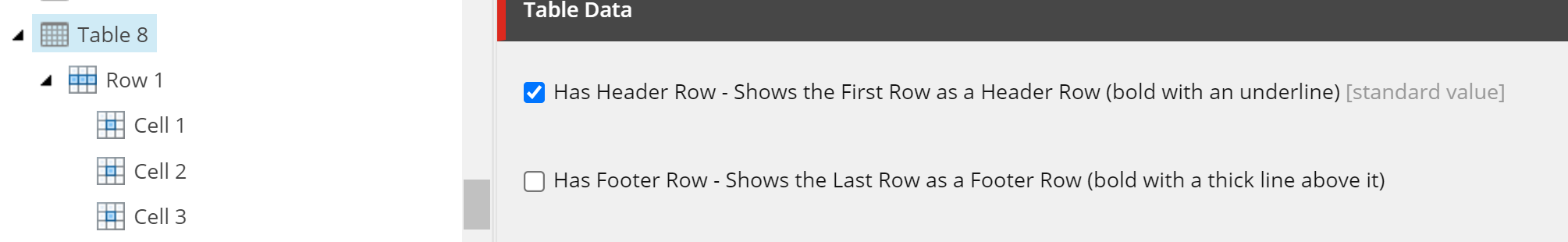
There are no specific fields on the Rows but the Table has two checkboxes:
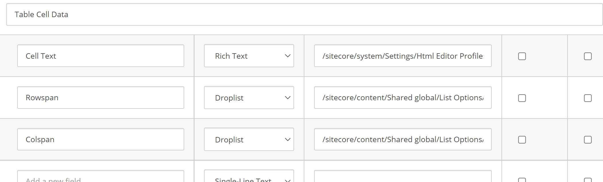
The cell template looks like so:
You can see the rowspan and cellspan options use a list of items as their datasource. We also use a custom RTE profile for the cell text to only allow a very small amount of RTE options.
Show me the Code
The following elements were required to build the component.
Rendering
The view is pretty simple. It just loops over the rows and outputs the cells. It also works out if a header and/or footer is required and if so renders out the correct mark-up for the first/last row. We are using Glass here so this may differ a bit for some sites. Note I’ve removed the code for row and cell span to make it easier to read:
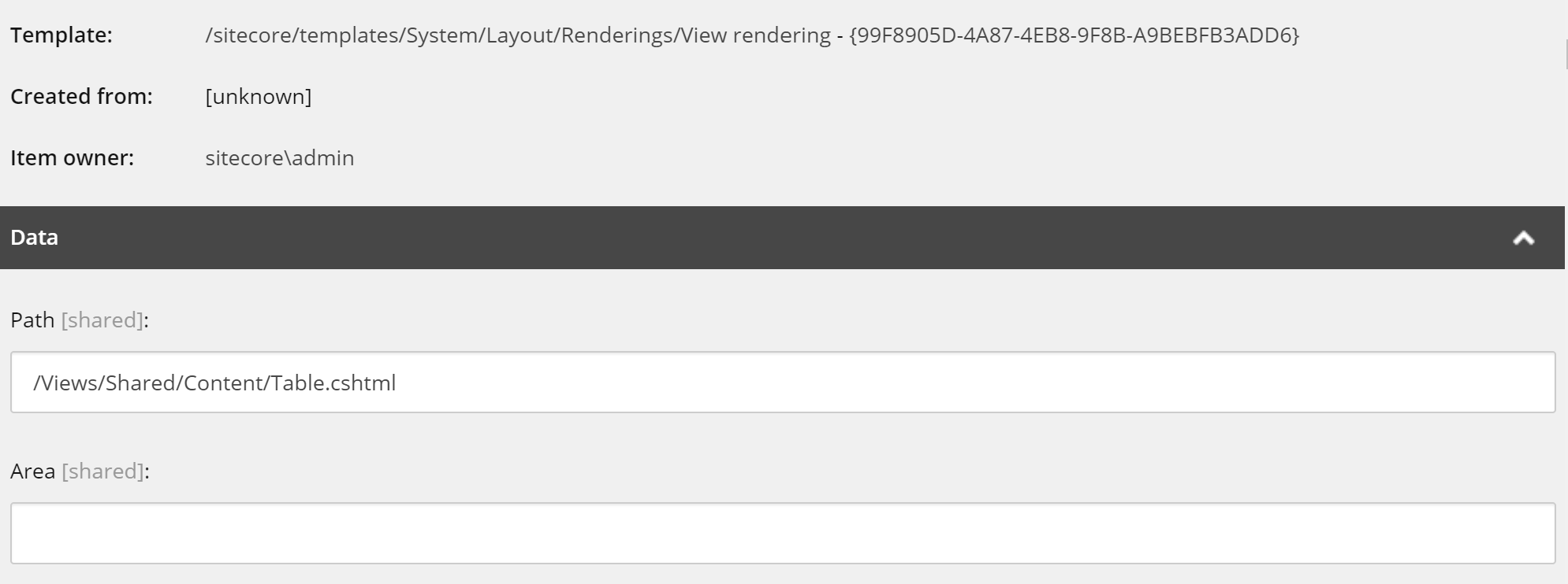
The rendering itself is just a simple Sitecore View Rendering:
Models
The following are the 3 models which are used by the component, again pretty simple. The models are mapped with standard Glass mapping for the fields so I’ve not included that here:
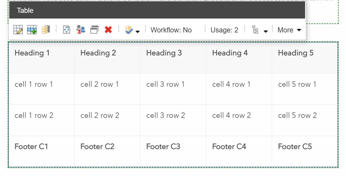
What does it look like?
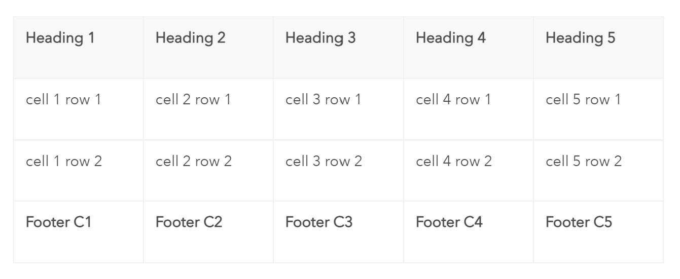
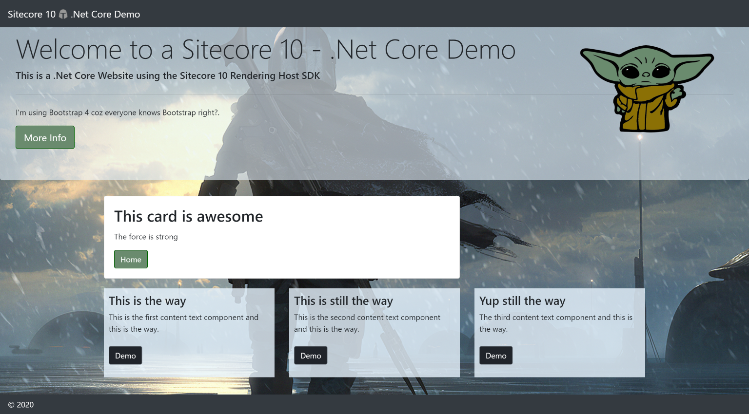
All being well you should see something like this output in the page:
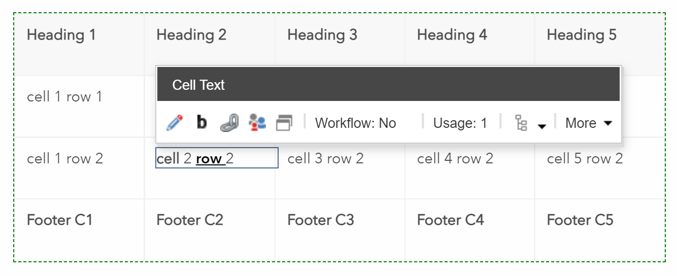
In experience editor you can edit the cells like so:
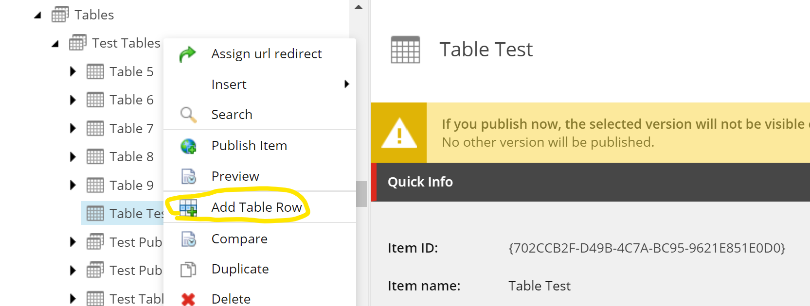
Adding Rows and Cells quickly
This all works quite nicely but it can be time consuming to add rows and columns, especially if creating large tables. So there was a requirement to automate this. So I created a custom action which works in both experience editor and content editor. It’s fairly intelligent as does things like checking to see how many cells exist for current rows when adding new ones, orders the cells and rows automatically and names them for the user too.
Here is the code, note you will need to update the template ids for the rows and cells if re-using this code:
It can be added to experience editor by creating an custom experience button to call the command and assigning it to the rendering.
Is this a good idea?
Inevitably there will be requests to add more and more functionality to the table component over time to support things like alignment of cell content and so forth which adds further development time and complexity to the component. However for simple tables this does work fairly well and is an option where there are complicated design requirements or content editor restrictions required for Tables.
Hopefully this is useful for those considering building a Table component and weighing up the pros and cons of doing so.
Last Thursday I presented at the London Sitecore User Group Online. This was the first online UK Sitecore user group this year, which was a response to the Covid-19 Pandemic.
I Demo’ed how to Build ASP.Net Core Components in Sitecore 10 with the ASP.Net Rendering SDK. The Demo uses a modified version of the Getting Started template to do this. An overview of the ASP.Net Rendering SDK is also provided and some useful Tips too.
Video Of Presentation
You can find a pre-recording of my presentation on my YouTube Channel here:
Steps To Build a Component in Sitecore 10
Bellow I’m going to detail the steps involved with Building a component in Sitecore 10 using the ASP.Net Rendering SDK. These are covered in the video but I thought it would be useful to write them down too and provide some further information where applicable.
Development Environment Setup
The first step is to get a Sitecore 10 Development environment setup. For my demo video above I used the getting started template. The Demo Video and this Overview starts from the point of having this installed. You could use docker and install everything yourself or install Sitecore 10 directly on your local development environment instead. However you would need to create your own Visual Studio project for the Rendering Host so this is more complex if you are just looking to experiment with this like I was.
note: to use the new ASP.Net Rendering Host SDK you will need to have access to the Layout Service within your Sitecore Licence, I believe currently this means you need JSS included in your licence.
I modified the Getting Started Template a little to include Bootstrap 4, some custom CSS and some new placeholders and components to make things a bit more interesting, but other than that my demo follows this fairly closely.
Building a Card Component
As covered in the demo we are going to build a Card Component (part of bootstrap) and follow a similar approach to the official documentation example for building a component. Assuming you’ve installed the getting started Template with the defaults the Sitecore CM instance will be visible here: https://cm.myproject.localhost/sitecore. If you wish you can add bootstrap 4 from here to the layout file in the Getting Started Template so that what you see will look more similar to the screen shot above. After completing all the steps below you could cerement your knowledge by adding an hero and some other components too (like I have above).
UPDATE (16/12/2020):
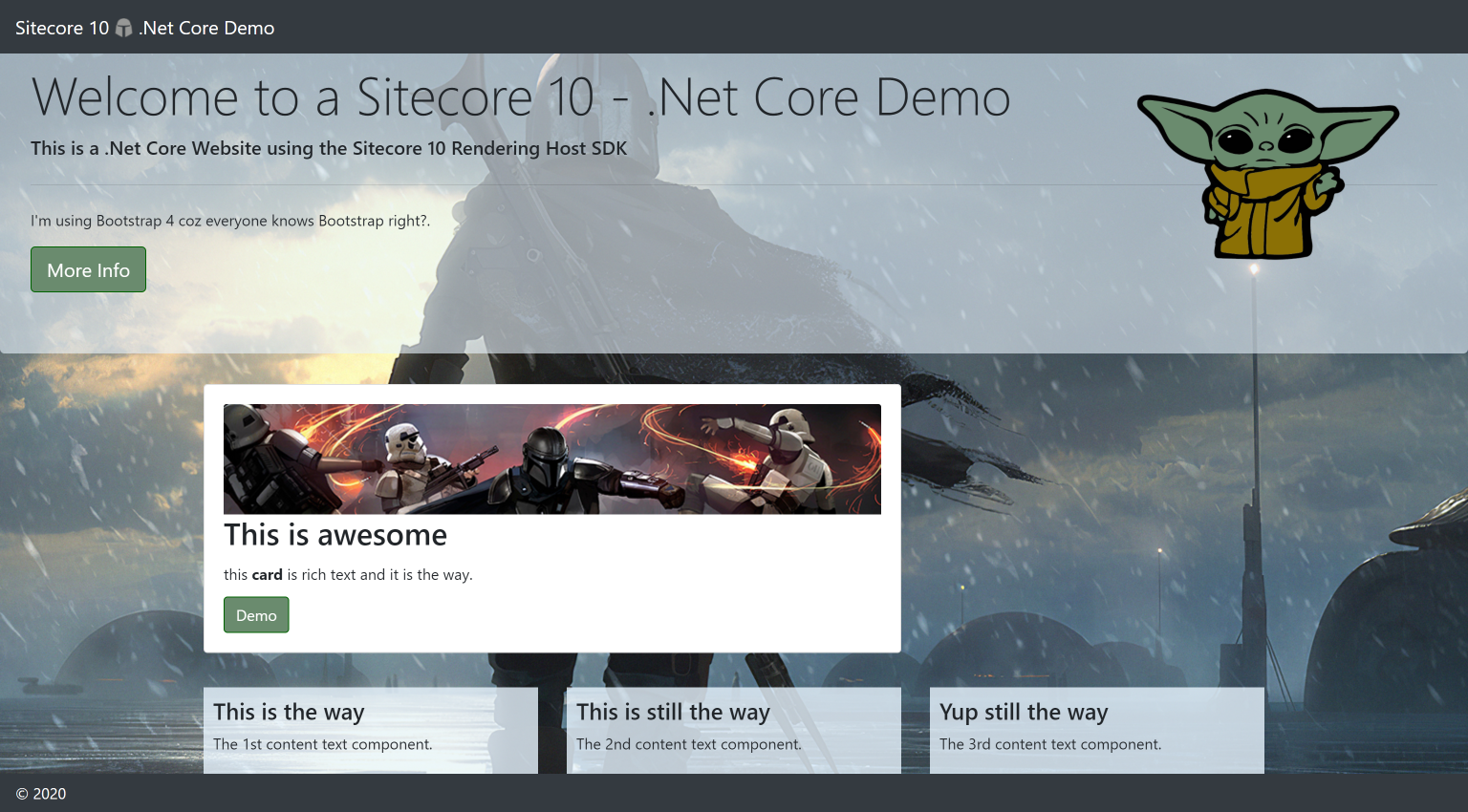
I got asked if my version is available when I presented this at the Pittsburgh SUG Recently so I've uploaded it to Github here for those that want to replicate the look and feel of my demo or look at the code I used.
This version also uses Rich text for the Text field and and includes an image field: https://github.com/fluxdigital/Mandalorian.Sitecore.NetCore
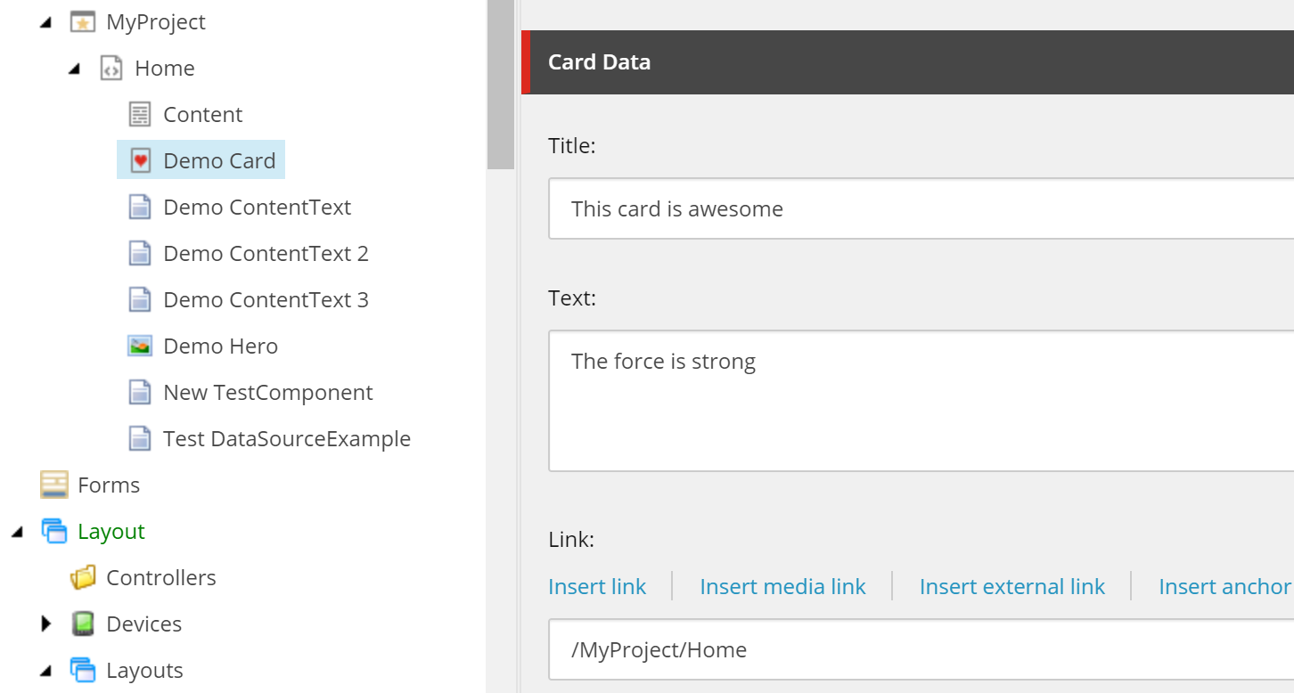
Create the Data Template
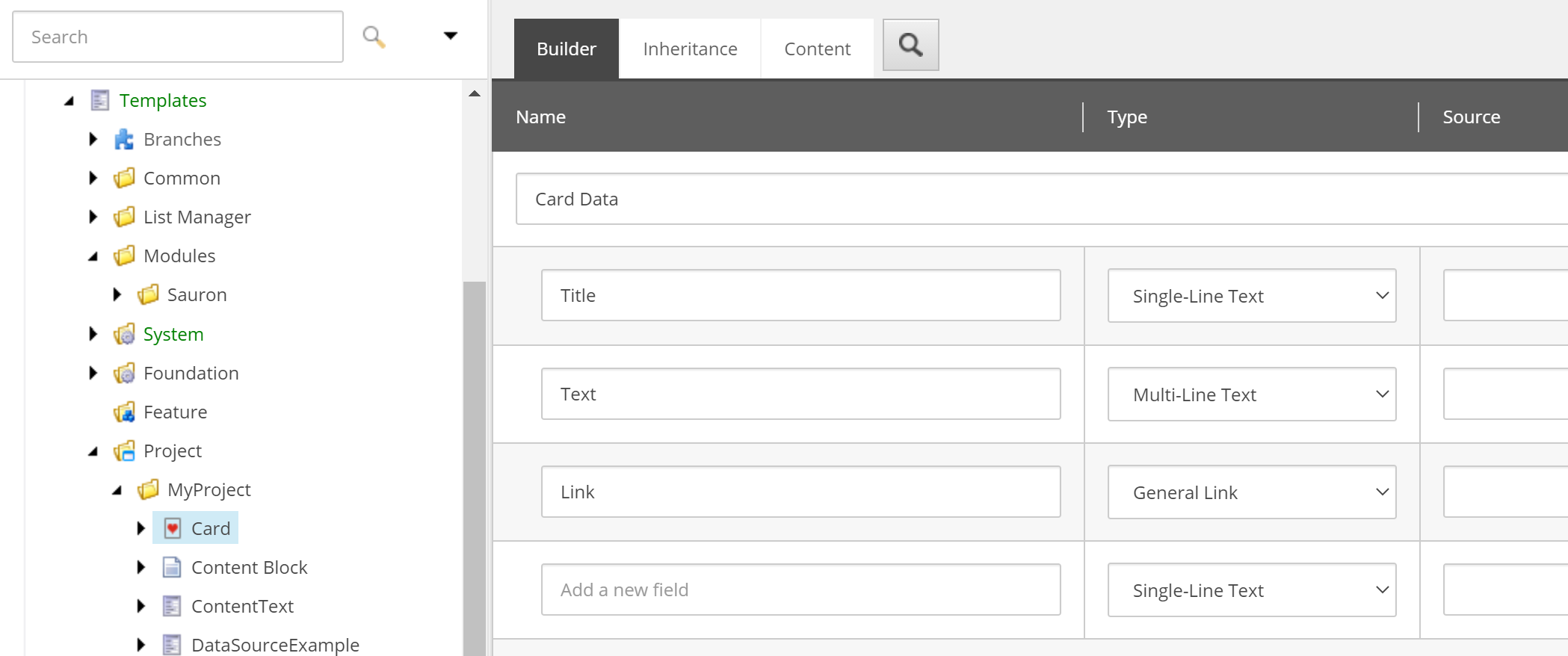
Create an data template called Card in the following location: /sitecore/templates/Project/MyProject. I called the data field section ‘Card Data’ but you can call it what you want.
Add the following 3 fields and set an icon:
Title – Single Line Text Field
Text – Multiline Text Field
Link – General Link Field
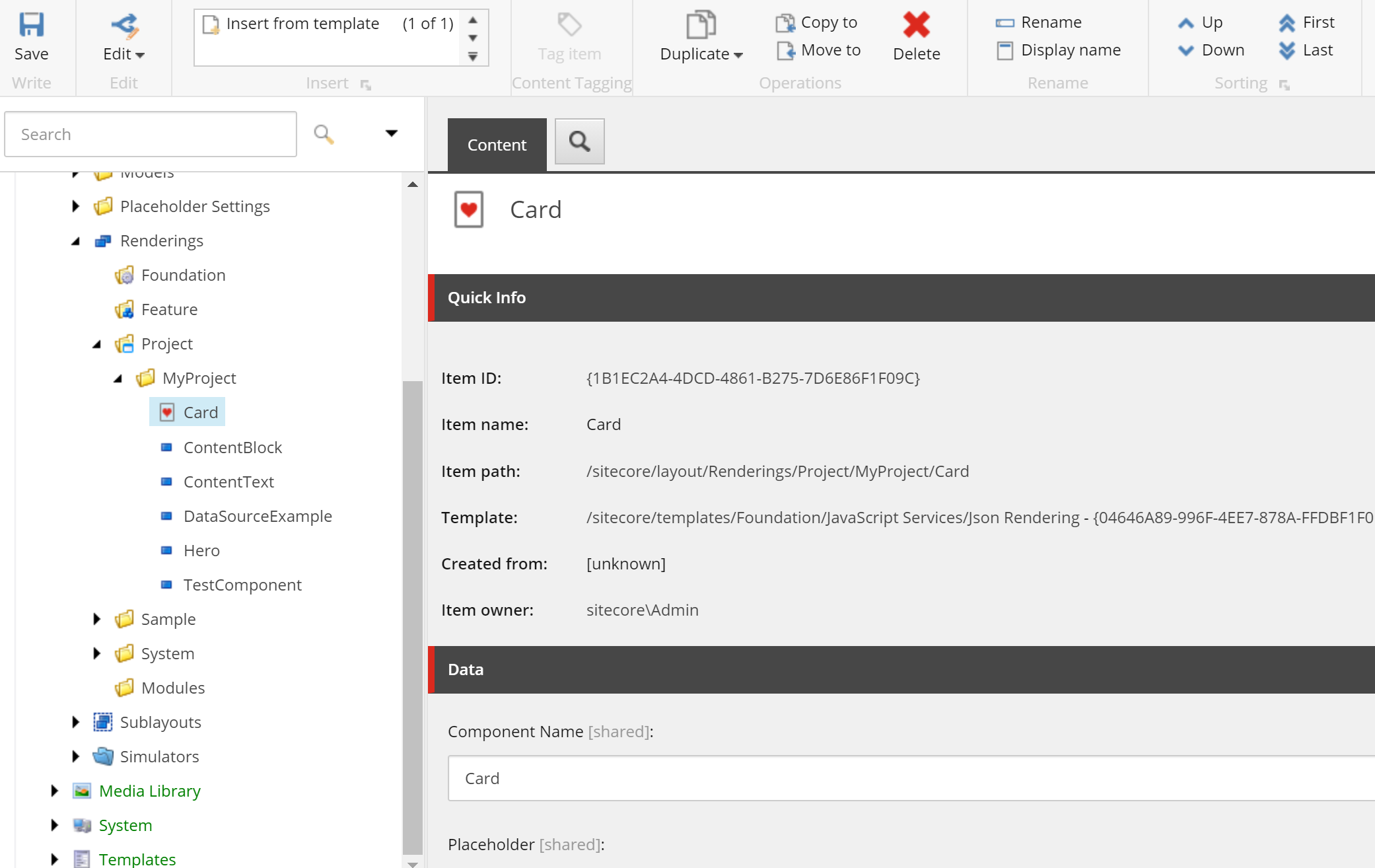
Create the Json Rendering
Create a new rendering using the ‘Json Rendering’ template called Card in the following location: /sitecore/layout/Renderings/Project/MyProject/Card. Leave the Component name as ‘Card’.
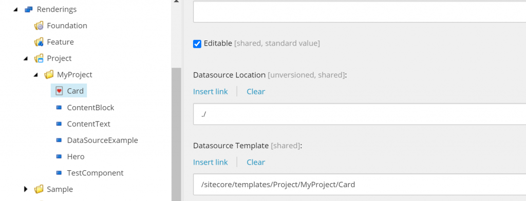
Set the Datasource Location to: ./ ,set the template to the Card template you just created and set an icon:
Create a New Placeholder
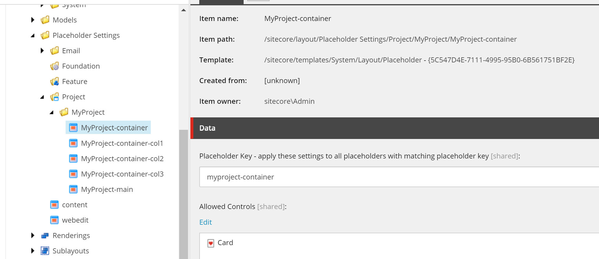
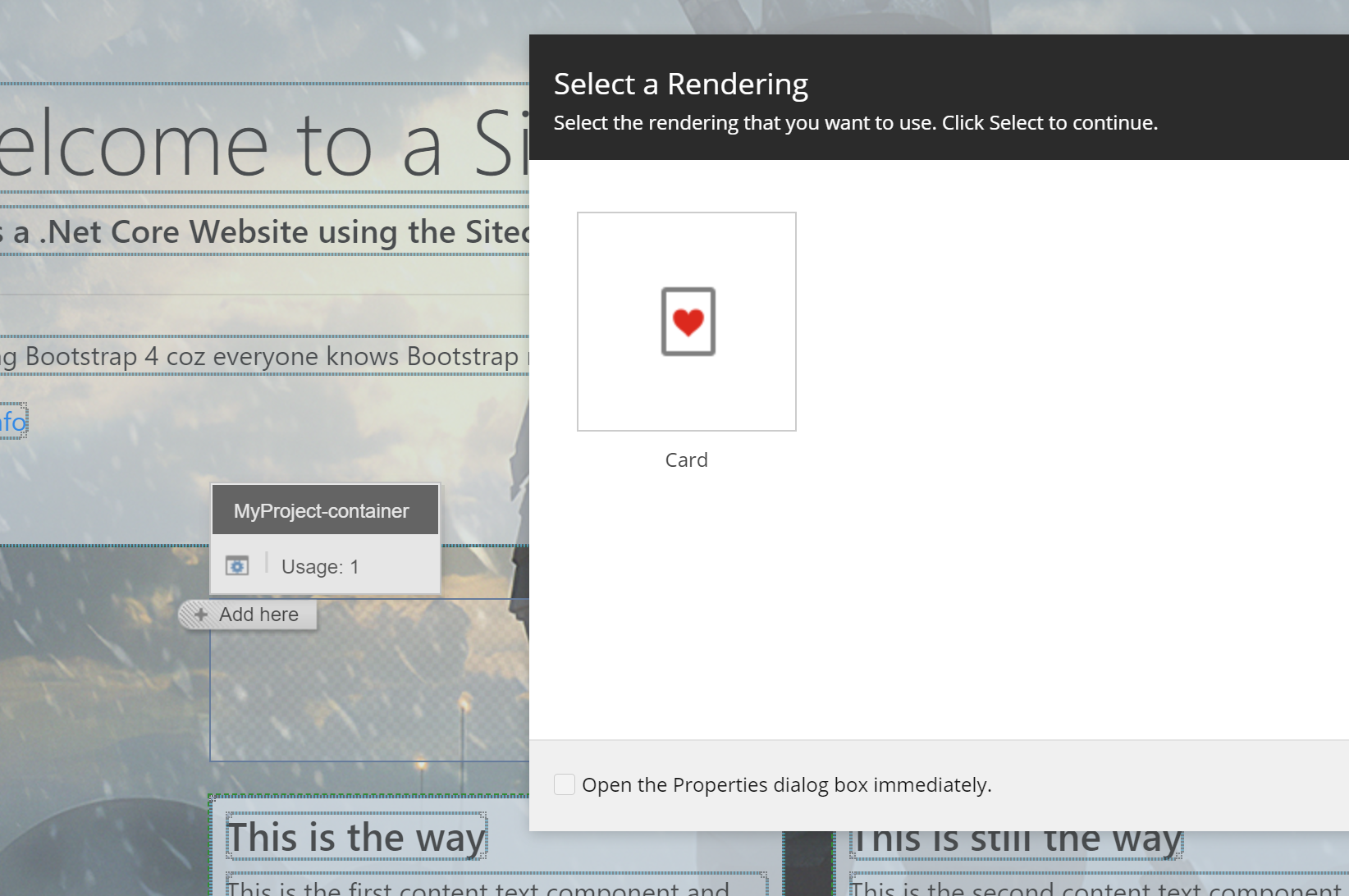
Create an new placeholder called myproject-container in the following location: /sitecore/layout/Placeholder Settings/Project/MyProject. Add the Card to the allowed controls.
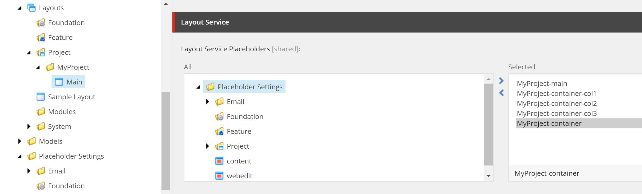
Add to Layout Service placeholders
The layout used by the Home item is as follow: sitecore/content/MyProject/Home. We need to Tell the layout service to return the placeholder.
Open the layout here: /sitecore/layout/Layouts/Project/MyProject/Main and add the myproject-container placeholder to the layout service placeholders field.
Add Card Item under the Home Item and populate the fields with some data.
Add the Card to the Page
Open home item in Experience Editor and add the card to the placeholder and save the page.
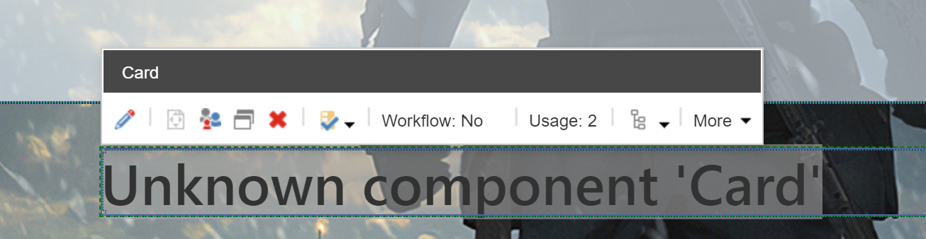
You will not see the card appear and will probably show an error message in place of the card at this point as we have yet to build the Component in Visual Studio and inform the Rendering Engine about our Component.
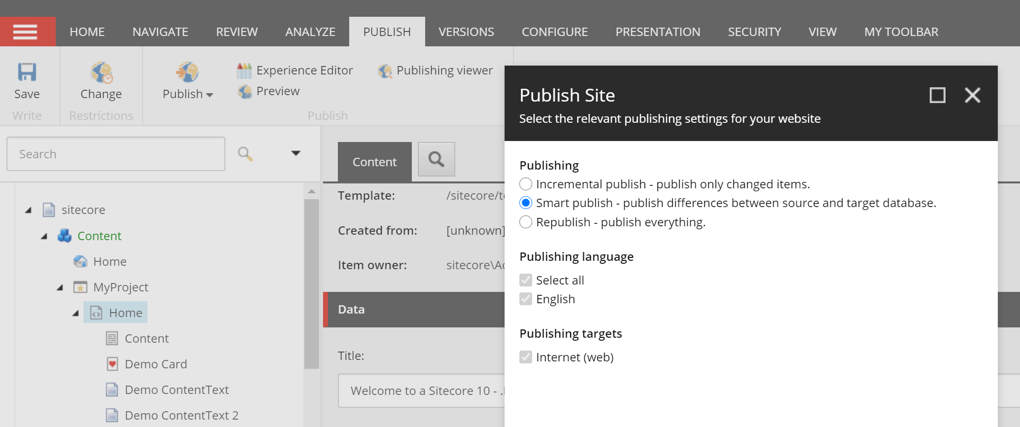
Publish the Site
Within the CM Smart Publish the Site.
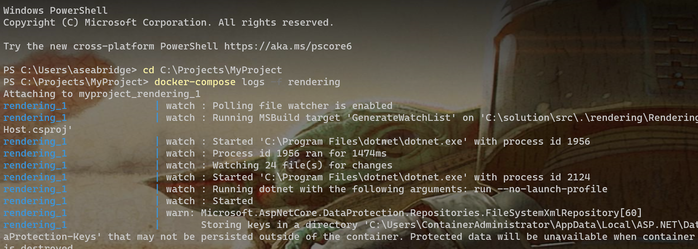
View Layout Service Debugging
Within the console you can Show the layout service response by typing the following command:
docker-compose logs -f rendering
If you scroll down the logs you should see an empty response in the layout service for the myproject-container as we need to do some work in Visual Studio now to get this working.
Create the Model
Within Visual Studio Create a new Model called CardModel at the following location: rendering\Models with the following contents:
 using System;
 using System.Collections.Generic;
 using System.Linq;
 using System.Threading.Tasks;
 using Sitecore.LayoutService.Client.Response.Model.Fields;
 namespace MyProject.Models
 {
   public class CardModel
   {
    public TextField Title { get; set; }
    public TextField Text { get; set; }
    public HyperLinkField Link { get; set; }
   }
 }
Note we are not using GlassMapper here we are using the new LayoutService Field Model. We use the TextField and HyperLinkFields for our Model.
Create the View
Create a new view called Card.cshtml within the following folder: rendering\Views\Shared\Components\SitecoreComponent\.
Add the following mark-up to include the 3 fields we created on our template earlier:
Within the Statup.cs file add the following line in bold to register the Card Model and Card View with the Rendering Engine.
// Register the Sitecore Rendering Engine services.
 services.AddSitecoreRenderingEngine(options =>
 {
 //Register your components here
 options
 .AddModelBoundView<CardModel>("Card")
 .AddDefaultPartialView("_ComponentNotFound");
 })
Add Placeholder to the Index Page
Update the index.cshtml layout file (rendering\Views\Default\Index.cshtml) to match the following. The main change here is to add the myproject-container placeholder:
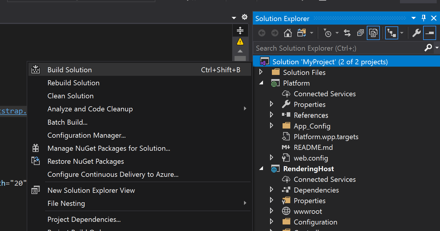
Save and build the project to deploy the changes to the Rendering Host. As the Rendering Host is configured to use dotnet watch it should build and deploy the changes to the rendering host on save, so an build shouldn’t be needed really.
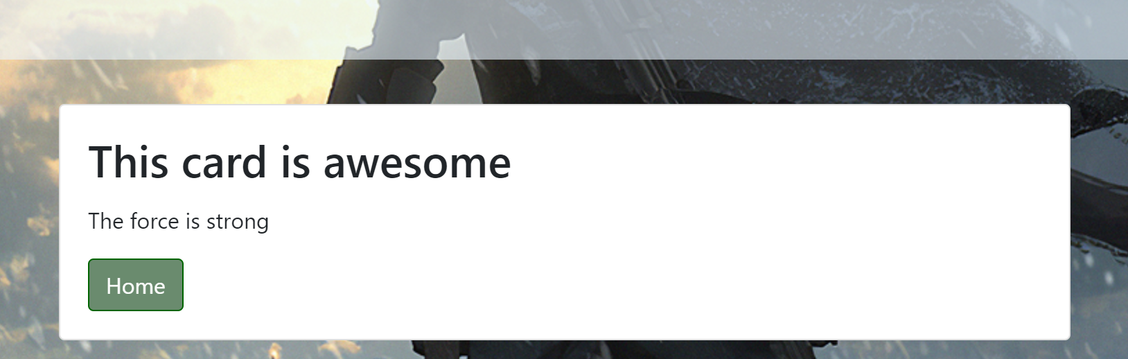
View the page
Refresh the published page (by default: https://www.myproject.localhost/) to view the Updated home showing the new card component.
Your card may look a little different to this but it should be similar. Well done you’ve just built your first component in Sitecore 10 :-).
Tips
There are a few tips I picked up during my experimenting with this.
Check the Docker Console & Logs for errors if you are having problems:
docker-compose logs -f rendering
If you have issues with Rendering Host or CM not updating then restart them both like so (docker can assign a new IP if you don’t restart both):
Ensure you have v14.1 or v15.1 of Siteore.ASPNet.* and Sitecore.LayoutService.Client DLLs as there was an issue with the v14.0 dlls not working with experience editor.
Hopefully the video of my presentation and overview are useful for those who are considering using this new functionality in Sitecore 10 or are interested in knowing more about how this works.
Lastly thanks to Nick Wesselman for his help with some issues I had along the way and some diagrams for presentation.